Tuesday, September 06, 2011

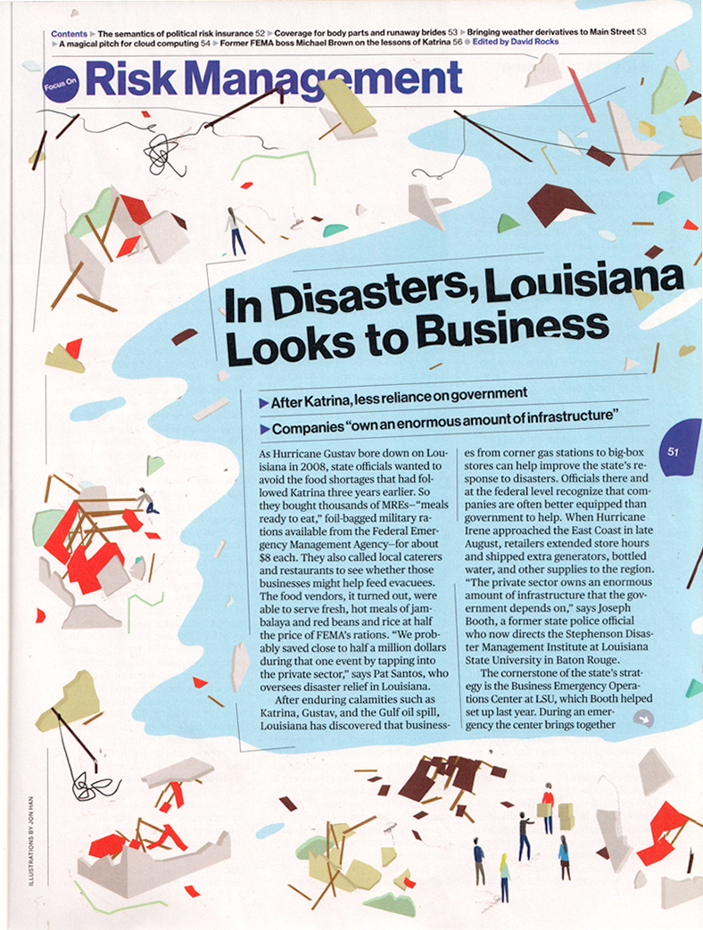
We make disaster

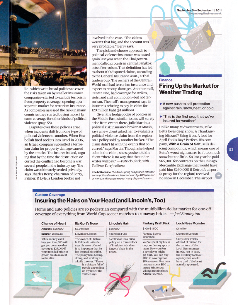
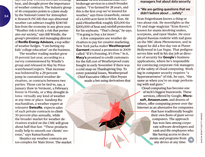
Really great working with Lee Wilson and Bloomberg BusinessWeek for their risk management section. I've done some illustrations before that played with the layout of the page, but was more of a collaboration to design the page of the opener. Always nice having the opportunity to do more then just a nice image.

Wednesday, July 13, 2011

Scientific American:Worldview


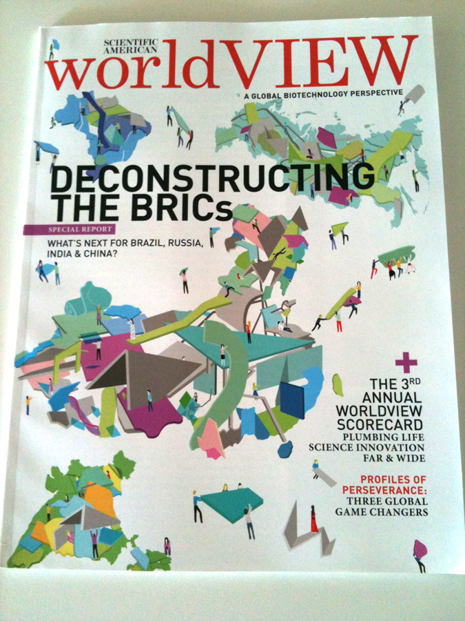
I was pretty excited to do the cover and a series of illustrations for the 3rd annual Scientific American: Worldview issue.
The feature article was on the BRIC nations (Brazil, Russia, India, China) and what makes them the new, up and coming nations.
The feature was breaking apart the BRIC nations and identifying what makes them so special, so the idea behind the cover was to deconstruct the BRIC nations, and i wanted to give it the same feel as deconstructivist architecture in a way. Really a lot of fun working on this, and the the open art direction was super great.

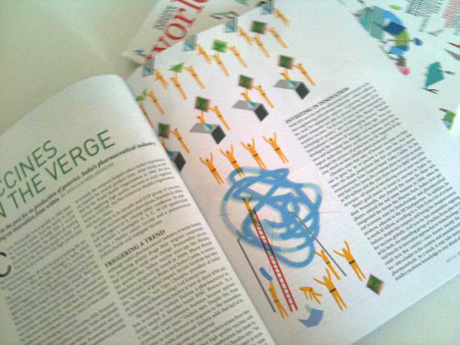
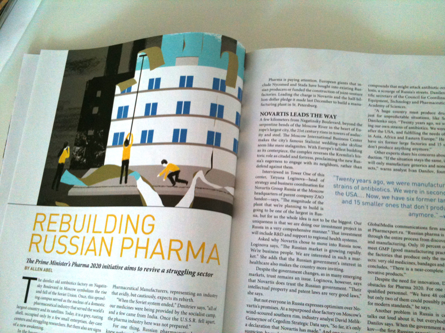
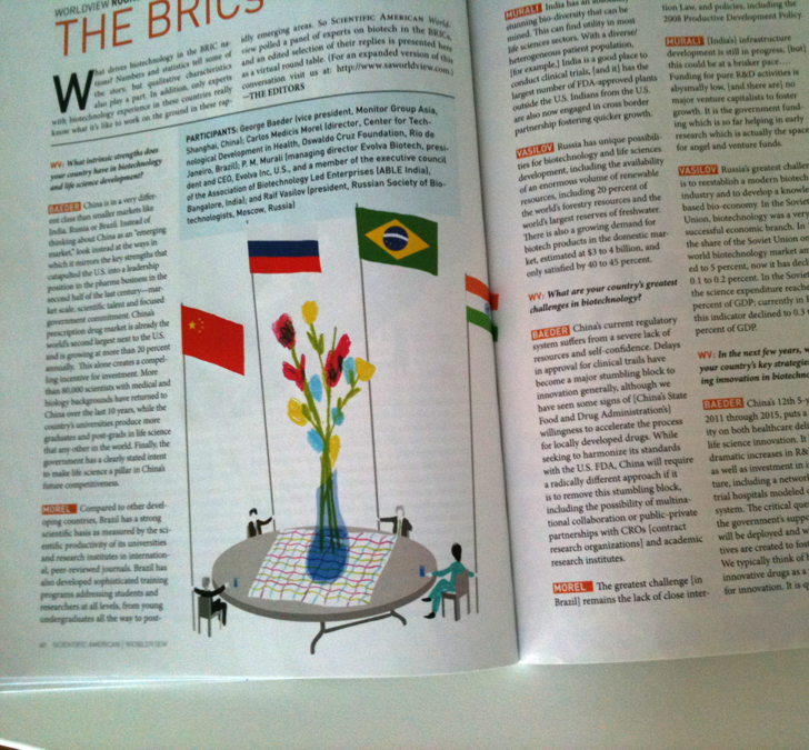
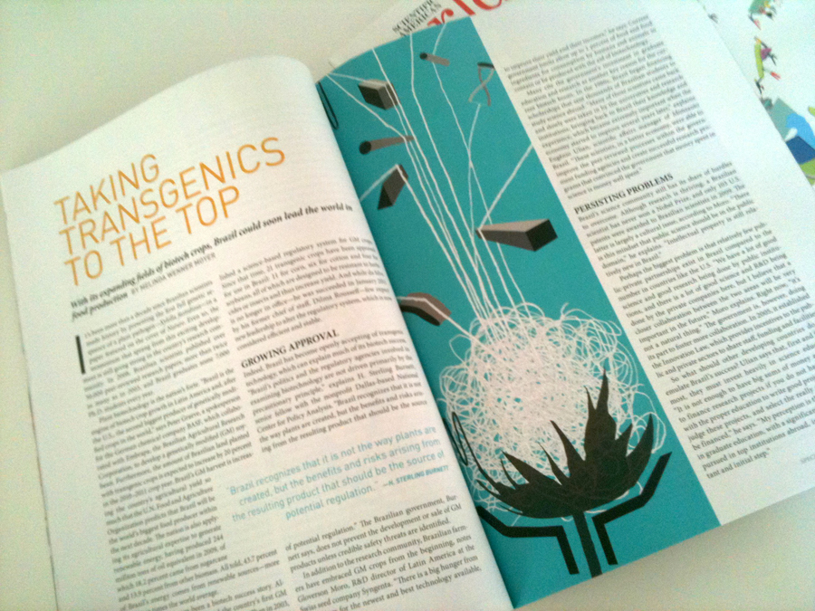
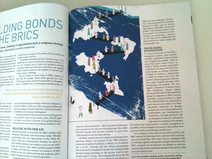
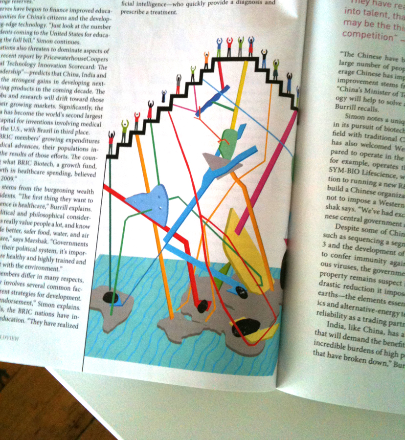
Below are a few pictures of the illustrations as they looked once publish and shot by an iPhone.


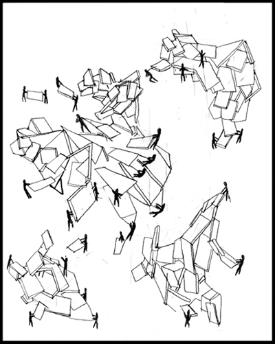
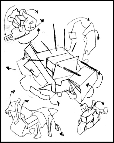
Here are some of my sketches for the cover and how i came up with the image, incase you wanted to see them.


So the final is sort of a mix of these 2 ideas.

You can download the whole issue and read the different articles by going to saworldview.com
Thursday, June 16, 2011

J+J=Ballroom Marfa Poster


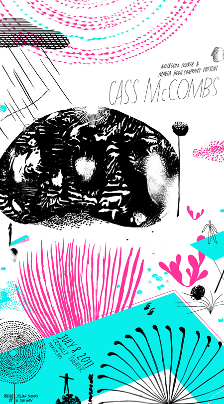
Its been a long time since i worked on a collaboration project. I think the last time I worked on something together with someone on a collaboration was back in my Art Center days. So it was definitely a fun experience working with the super Jillian Tamaki on this poster for the Ballroom Marfa.

The posters will be 3 color silk screen prints 36 inches tall. The prints will be released in limited supply, for more information about the poster and event you can go to, ballroommarfa.org.

Friday, May 20, 2011

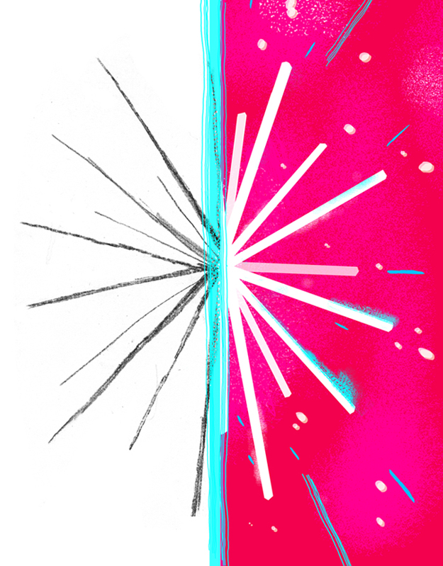
Much, much, more than you thhhhhooooughhhhttt.


This was one of three illustrations for Proto Magazine, the full page opener. The article was about the new discoveries about Glia cells which have been, until now looked at as just simple cells. Through different types of scans, they've found them to have more depth then previously thought.

So for this i just wanted to show a pretty simple 2 dimensional drawing contrasted by something that gave more visual depth, and had a sense of dimension.